Today we are writing to announce that we have published the last issue of The Synopsis. It was a fun experiment, which unfortunately no longer makes financial sense to continue onwards with.
Terribly disappointed to read this. I looked forward to seeing The Synopsis update popping up in my daily RSS feed, and it was a great replacement for the dearly departed Tab Dump. I’m no news junkie, and that’s why The Synopsis was so great: just a quick way to find out what happened in the last 24 hours.
I hope someone fills the void, and quick. I’d do it myself if I had the time.
Maybe it’s because I spent many of my early years in libraries, or maybe it’s because I’m just wired a certain way, but I find the way iTunes organizes music, out of the box, infuriating. The default way iTunes alphabetizes everything throws me off. Take artist names. I learned from an early age that when dealing with any form of media, you alphabetize based on the last name of the artist. So, if you’re dealing with albums by Elvis Costello and Elvis Presley, you would sort the former under “C†and the latter under “Pâ€. Instead, iTunes sorts both under “Eâ€.
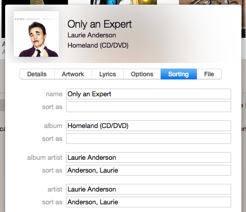
An even more egregious example is bands whose names start with “Theâ€. Definite articles, in any language, are ignored with alphabetizing anything. Otherwise, you have a huge stretch of a music library of just “The†bands: The Beatles, The Clash, The Doors… which makes finding things a pain. Fortunately, iTunes added a feature back in version 7 to make this sane: Sort Tags. It’s possible to now set how you want an artist’s name to sort. By default, iTunes, since version 7, ignores “The†when sorting artists and albums. You can also assign a sort tag to an artist so that it places them last name first. So, the first thing to do if you want your iTunes library organized and sorted properly is to set your sort tags. Any artist known by a first and last name (even a stage name) is assigned a sort tag in my library in the format “Last name, First nameâ€.
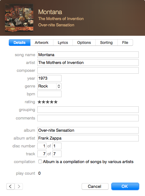
A trickier problem comes if you are a fan of any band or artist that’s released material under multiple band names. If you’re a fan of Frank Zappa, you might understand the issue well. Some of his material was released under the band name “The Mothers of Inventionâ€, some as just Frank Zappa, some as “The Mothers”, some as “Frank Zappa & The Mothers of Inventionâ€, and at least one as “Zappa / Mothersâ€. Enter the Album Artist tag. You can set different values in these tags, so by assigning Album Artist the value of “Frank Zappa†(sorted as “Zappa, Frankâ€), and Artist as “The Mothers of Inventionâ€, all my Zappa albums appear together, but the artist value is correct for playback and tracking in Last.fm.
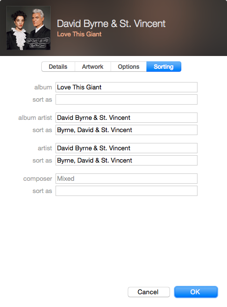
The trickiest of all problems is how to deal with joint albums, say David Byrne’s collaboration with the amazing St. Vincent. I found an easy solution by assigning the joint act’s name to the both Artist and Album Artist fields, and sorting by the last name of the top billed artist. I’m flexible on solutions for this one, but keep in mind that standard alphabetization practice is always based on the name that comes first.
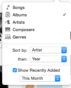
You’re now most of the way to a properly organized and sorted iTunes library. There’s one more change you’ll need to make, however. By default, iTunes not only organizes artists alphabetically, but also albums. This is a no go for me. I organize all my albums by date of original release, and so should you. This one’s easy to fix. Click the drop down at the top-right corner of your iTunes window and set the “Sort by†drop down to “Artist†and the “Then†drop down to “Yearâ€.
You’ll then want to go back through your library to make sure the dates on your albums are set to the correct year—the year of their original release. If you don’t want to do this manually, the free MusicBrainz Picard Mac app is a great solution for cleaning up your tags automatically. Even if you bought all your music from iTunes, it’s worth running it through Picard, because iTunes releases often assign the date to the year it was released on iTunes, and that helps nobody.
That’s all you need to do. Get proper album artwork, either from iTunes or Album Art Exchange, and then you can enjoy your music, organized properly, like a civilized human being. Sort Tags, and Album Artist transfer to iOS devices , so your artist views will be properly organized, though you’ll also need to switch on “Group By Album Artist†in the Music section of settings. Sadly, iOS devices don’t allow you to sort albums by year within an artist view, but my iOS replacement music app of choice, Cesium, does. It’s worth the $1.99 for the peace of mind.
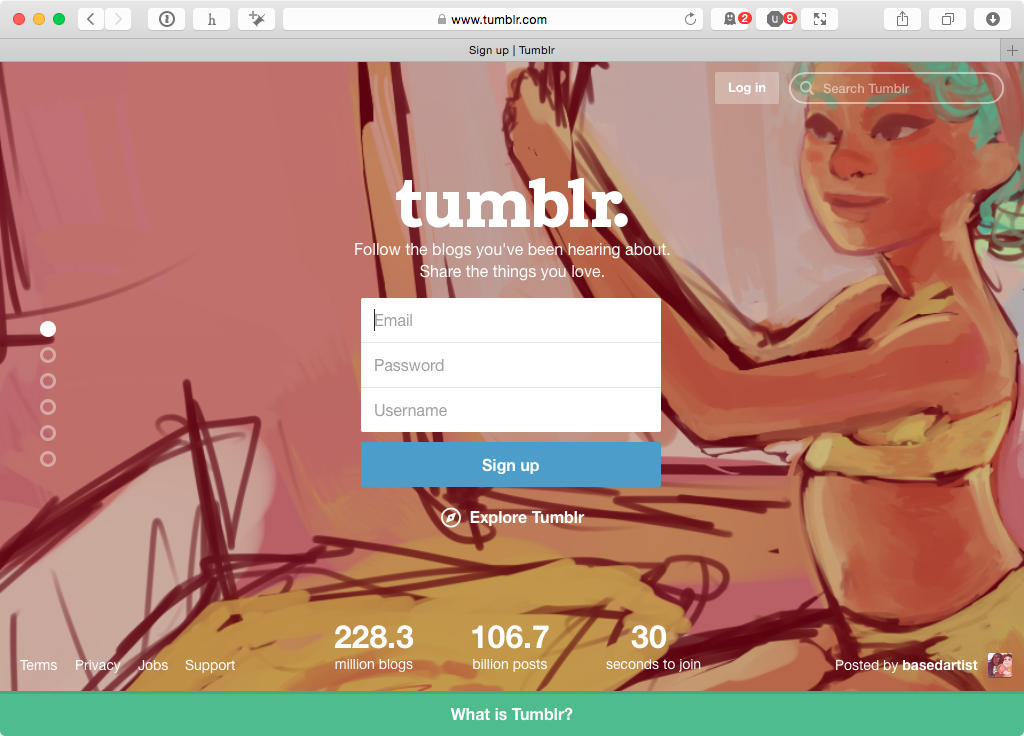
There’s a trend across the Internet for big, graphical home pages designed to funnel new user growth. Tumblr’s home page below is a perfect example of the form: a giant background image with a clear and obvious sign up form. There’s just one problem, and it only affects existing users: the “Log In†button is almost impossible to find.
It’s translucent, gets lost against noisy backgrounds, and shoved off into the top left corner. That’s been shown time and time again to be the last place a user looks, at least for cultures that read left-to-right. It’s not just the web. Even phone apps are getting into this nonsense. If you look at myFitnessPal, the “Log In†button is given second billing, under the “Sign Up†option. To a new user, someone who might have started with myFitnessPal on the web, and wants to start on their phone, they could easily miss it. There’s nothing to make it stand out as a button, except that it’s in bold text. [1]Â
This is the result of “growth hacking†and optimizing for new user growth over existing users. On the surface, it makes some sense. The most important metric, especially if you’re looking to get VC funding, is often new user growth. By making it easier for a new user to sign up to your product, you have a better shot of making that hockey-stick growth curve happen. A necessary evil, to be sure. I’m unable to find stats on how many users click the “remember me†boxes on many sites, or how many sites leave it checked by default. I’ll assume that once someone is logged in, they’re logged in, almost for good.
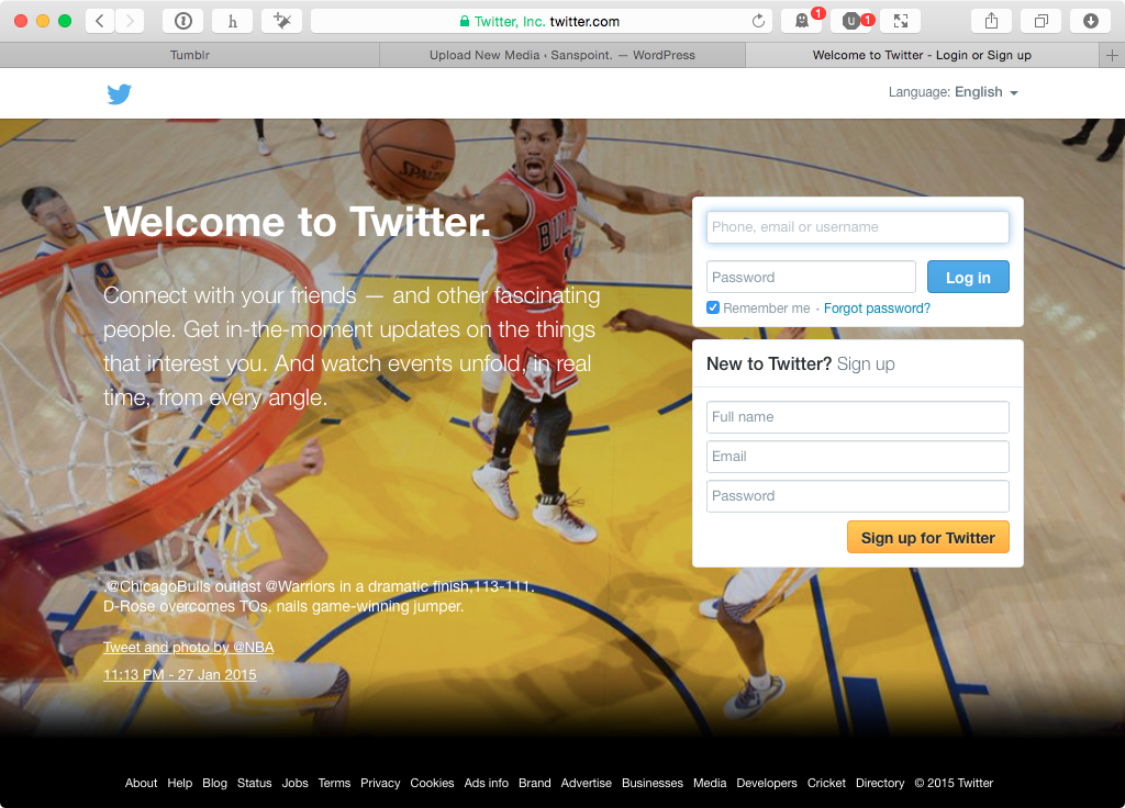
Almost is the key word. A user might switch browsers, or they might switch operating systems—on desktop and on mobile. They might opt not to restore their new phone from the cloud backup, if they have it. Hell, someone malicious might just log them out for the fun of it. Any UI/UX designer worth their salt should be prepared for such an inevitability and make it easy and obvious to log back in. Balancing that with the need to drive user growth isn’t difficult, either. You can do what Twitter does, by having a login form and a sign up form on the same page, but I have a better idea.
If you’re set on just having one form to rule them all, why not make it clear that you can use it as both a signup form, or a login form? To Tumblr’s credit, I tested their sign up form to see if it worked that way while writing my complaints, and it does. There’s no indication that this is the case, however, until you click the button and are taken to the dashboard. Good UI and UX requires that the behaviors be clear and defined for the user. There’s no excuse otherwise. “Growth hack†if you must, but do it in a way that respects your existing users. Stop hiding “Log In†buttons, for a start.
It’s tiring to lug around your armor of spurious competence. And it’s equally exhausting to weather a swarm of weigh-ins from everyone and his brother (you guys don’t need me to tell you this is an especial behavior of men, right?), or stare down another slog through the hot-take-backlash-counterintuitive-take-counterintuitive-take-backlash-wet-blanket-hoax-accusation opinion cycle. Everyone is burned out by thinking something about everything. Everyone is even more burned out by everyone else thinking something about everything.
No opinion is a valid opinion. We don’t need to constantly spout out thoughts on the issues of the day, or issues of the minute. Admit your ignorance, shut up, and listen to the people who know what they’re talking about. There’s no shame in doing so.
I have never had a love/hate relationship with Facebook—more of a tolerate/hate relationship. It’s the most demanding of all the social networks I use, demanding, begging your attention to everything your friends and acquaintances are doing for the dopamine burst reward of comments and likes. All to get more information on you, to sell to advertisers and feed The Algorithm that determines what you see. Others have tried to break The Algorithm, some by liking everything they see, others by hiding everything they saw. These are fun experiments, but neither solves the problems I have with Facebook… the endless flow of information that demands my attention. There is only one solution.
A couple of weeks ago, I unfollowed everyone on Facebook. My friends, my family, the groups I belong to… they’ve been explicitly denied the right to appear in my timeline. The result is beautiful, empty silence.
When paired with Social Fixer to hide the rest of the obnoxious Facebook experience, (including my own sporadic posts), Facebook becomes just what you see above: a non-entity, pure empty state. I want to begin following the people closest to me—otherwise, Facebook becomes a huge web back-end for a messaging and event tracking service, rather than a social network. I’ve demurred, because I worry that even allowing a few, important souls into my quiet space will soon become overwhelming, not because of the people, but because of The Algorithm.
The Algorithm is optimized to keep us using Facebook. It doesn’t just show us our friends statuses any more. The Algorithm shows us the comments our friends are making on their friends statuses. The Algorithm likes they’re making on posts by brands paying for reach. The Algorithm feeds us controversy, outrage, and all the noise, noise, noise, noise of people feeding The Algorithm. If there was some way I could be sure I’m only getting the important stuff from my friends: not the events they’re going to, the likes for whatever stupid meme George Takei’s social media person is reposting… if I could be sure I was only going to get signal instead of noise, I might be tempted to follow someone again.
Might.
But, as it stands, I’ve somehow turned Facebook into a calm sea of emptiness. When every site on the web, every app on our phones, and so much else in our life makes constant screaming demands for our attention, I’ve managed to turn the most obnoxious of them all into a place of tranquility. Facebook is now a place that demands nothing of me. And, in return, I can give it nothing, guilt-free. At least until The Algorithm finds a way around it.